
Seasonal Salt
the brief
Jen Rivera is a recipe developer, food dignity advocate, and author whose sustainable, low-impact cooking advocacy is in high demand across grassroots and non-profit networks. As her work grew, she faced an exhausting friction: a DIY visual aesthetic that fell short of her expertise and the profound care behind her mission.
Instead of a cold corporate facelift, Jen needed a welcoming personal brand that honoured her authority while retaining the genuine human warmth at the heart of her advocacy.
My objective was to untangle her visual identity into a cohesive brand experience. This new visual home allows her to connect directly with publishers and overstretched households alike, reclaiming her time so she can focus entirely on her frontline mission.
scope of work
Brand Identity Refresh
Landing Page
Business Cards & Social media
.png)
.png)
The Challenge
Jen’s advocacy started in 2009 as a personal blog with a close-knit, loyal readership. But once she published her first book, she stepped into a new arena negotiating with commercial publishers and presenting to non-profit boards where her visual identity needed to command immediate respect. She desperately wanted a website and brand that reflected this milestone, but she was terrified of losing the intimate, organic vibe her community loved.
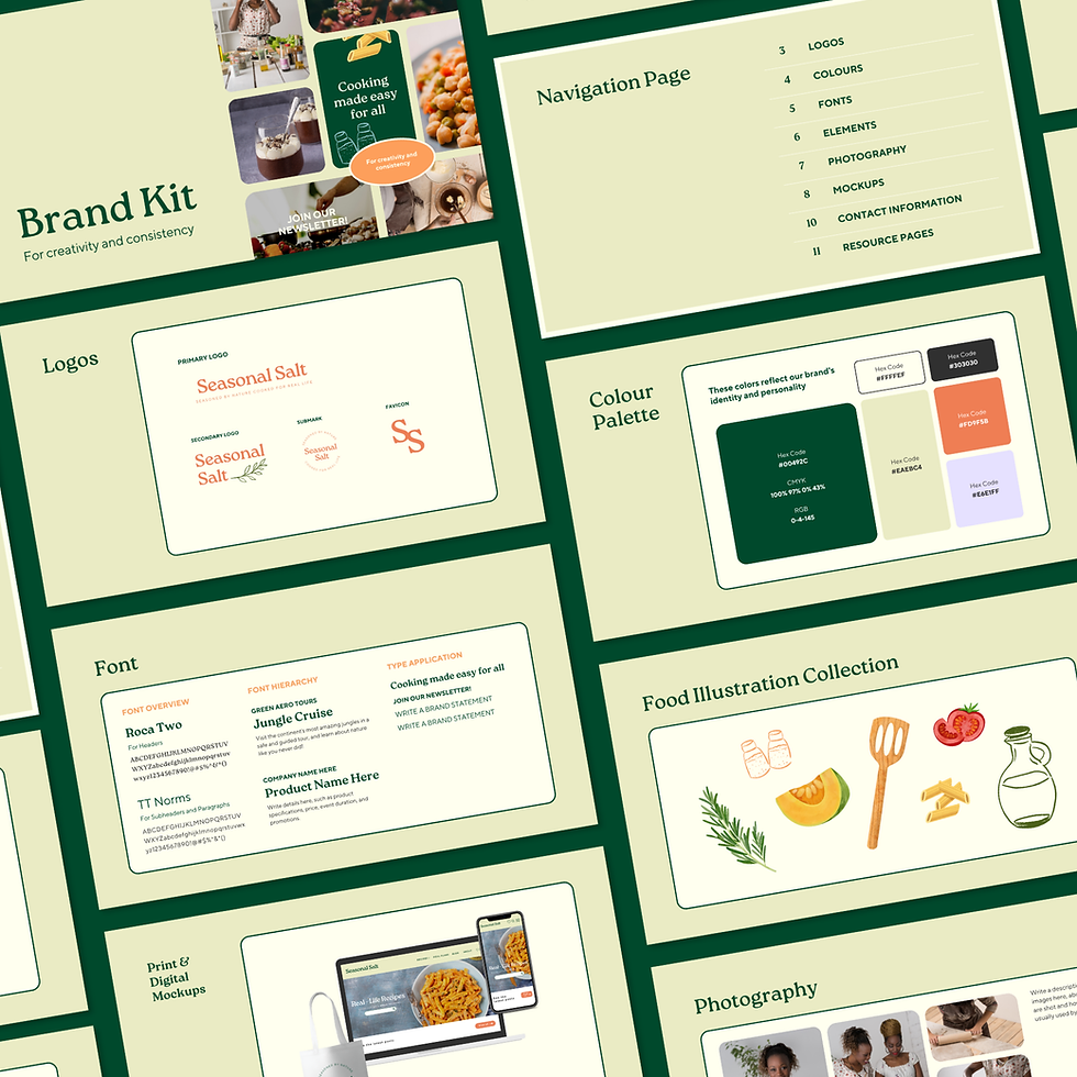
My job was to walk this delicate visual line. I needed to build a polished, credible presence for publishers without letting her earthy palette feel cold or sterile. This meant approaching web accessibility (WCAG) not as a technical chore, but as a direct act of community care, ensuring her resources remained open to everyone. By untangling her messy DIY workflow and replacing it with cohesive, simple templates, I gave Jen the structural framework to pitch her dream projects with absolute confidence while protecting the warm, human heart of her frontline mission.

.png)
the strategy
To bridge the gap between Jen’s grassroots warmth and the commercial credibility she needed to pitch to major book publishers, I knew we had to look far beyond a superficial logo refresh. Her recipes and publishing drafts were scattered across disorganised documents and manual templates that ate up her valuable time. I stepped directly into this creative chaos to audit her resources and untangle her workflow, establishing a systematic, stress-free backend foundation.
The core of my strategy was to treat visual order as a profound act of care and respect for her audience’s attention. I designed a system of "flexible consistency," ensuring that every layout was structurally bulletproof and WCAG-accessible, yet remained deeply relational, grounded, and human. By taking the creative heavy lifting entirely off her shoulders, I didn’t just give Jen a beautiful brand, I built a functional ecosystem that gave her back her time and the operational space to focus on her frontline community mission.



the outcome
The final outcome of this rebrand went far beyond a fresh logo; it fundamentally shifted how a grassroots platform can present its mission to the world. By taking the creative heavy lifting off the advocate's shoulders, I replaced an exhausting, manual DIY routine with a streamlined, cohesive publishing system. Reclaiming these hours from design frustration frees up the vital mental and operational space needed to focus entirely on frontline community work.
On a strategic level, this visual transformation establishes immediate operational credibility in the eyes of commercial decision-makers. The resulting proposals and pitch decks now command instant respect from risk-averse book publishers, non-profit boards, and corporate sponsors, proving that an ethical, purpose-led mission can be a major competitive advantage in high-stakes rooms.
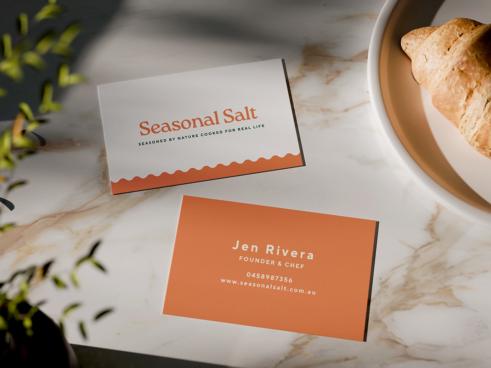
This project was developed as a self-initiated brand concept to explore how grassroots community advocates can scale their platform professionally without losing their organic, human warmth. By limiting my process to strict WCAG accessibility guidelines and a hypothetical launch timeline, I wanted to prove that visual structure is a profound act of care for an audience's attention. Testing and refining this elastic layout system taught me how to blend tactile, physical brand details with technically flawless digital infrastructure, paving the way for ethical leaders to pitch their dream projects with absolute, unshakeable confidence.
Paola Antieri